Swift services
Home Service Adaptive Website


Project Overview
This platform links users with talented local professionals for efficient and convenient home repair and maintenance services. It serves those who either lack the time or the skills to tackle household issues, providing dependable and prompt solutions.
About Swift Services
Our project had two main tasks:
focused on finding and booking plumbing services on Website
focused on finding and booking a cleaner on Mobile App
Business Needs
There isn't a platform available that can comprehensively identify and fix all home issues, such as plumbing, cleaning, and electrical problems, etc while providing access to a diverse array of technicians to address these challenges efficiently.
Target Users
Someone who needs a technician
The technicians who provide services
Business Goals
Encourage users to choose our services.
Foster trust in our Platform.
Inspire people to join us as providers.
Challenge
We offer a variety of services, providing users with a wide range of options in the search bar. It’s important to present these options in a way that ensures a great experience for each user
Design Thinking

Survey
User Interview
Competitive Analysis
Affinity Diagram
Persona
Site Map
User flow
Task flow
Mood board
Ui kit
Sketch
Mid-fid wireframe
Prototype
Usability Testing
Accessibility Testing
A / B Testing
Solution
Initial problem
Problem definition
Discover
To identify users' pain points and create effective solutions, we used a comprehensive research approach that included the following methods:
Survey
Competitive Analysis
User Interview
Survey
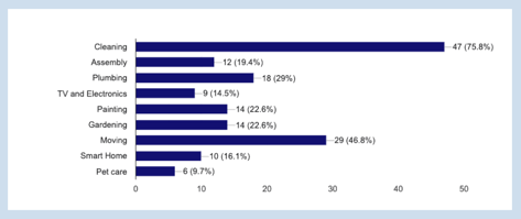
To gain a deeper understanding of user preferences, we conducted a brief survey with 64 respondents. Here are some key insights we gathered.

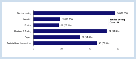
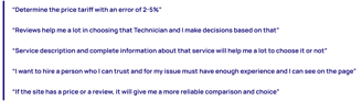
Just 50% of respondents cited that as important

Transparent price of services
Rate and reviews
Availability time
The results indicated that cleaning, moving, and plumbing as their primary service needs.
Key Takeaways
The business informed us about the existing services, so we used the survey results to prioritize them.
We decided to design two options: urgent access and normal access. The system provides users with available experts in their area based on their choice.
At first, we planned to include a badge feature to indicate each technician’s background check status, expecting it to be important. However, after reviewing the survey results, we decided to display this information on the technician’s profile page instead.
What kind of services do you require for your place?
Which details are important to you when selecting a technician?
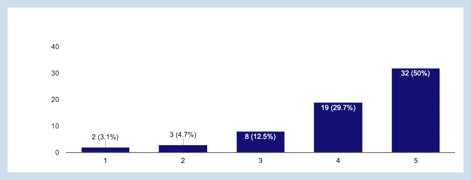
How important is it for plumbing services to have background-checked staff?
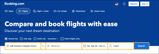
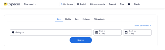
Competitive Analysis

Additionally, we conducted a competitive analysis by exploring two types of websites: one with a similar business model and another to evaluate their flow and user-friendliness. This helped us gain valuable insights and inspiration.
Key Takeaways from similar business model
We needed to design a search bar navigation with many different items so we inspired two popular websites Booking.com & Expedia and then we created useful search navigation.
The research highlights that users need detailed service descriptions to make informed choices that best suit their needs.

Key Takeaways from the Inspirational Models
User Interview
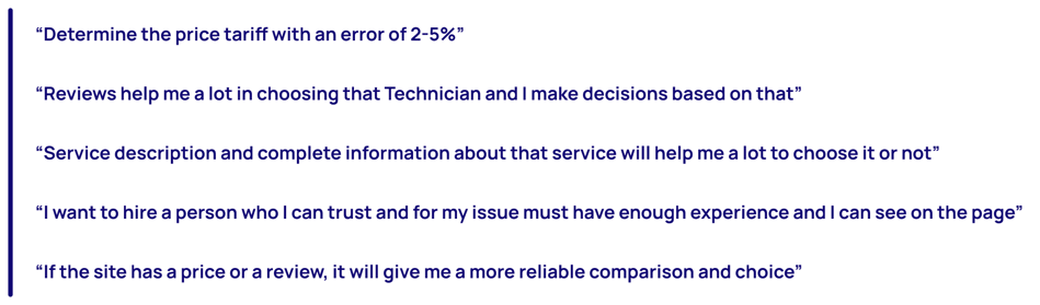
After interviewing 20 potential users, we collected direct quotes that provided valuable insights and guided our design process.
Define
Affinity Diagram
After interviewing 20 potential users and creating an affinity diagram, we discovered a recurring need when searching for someone to fix a home issue.
Price/cost: Users prioritize viewing the detailed breakdown of the price card. Having comprehensive information about each component helps them feel confident in using the services
Key Takeaways
Technician Details: Users want to see a personalized profile for each technician, allowing them to choose based on skills, abilities, and reviews from others
Simple category: Users felt they lacked in-depth information about each service, so a simpler approach could be highly beneficial.
Persona

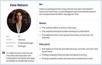
After conducting interviews and analyzing, we identified a user persona for the Swift services website. Users' needs and challenges, guide us through the app development process.
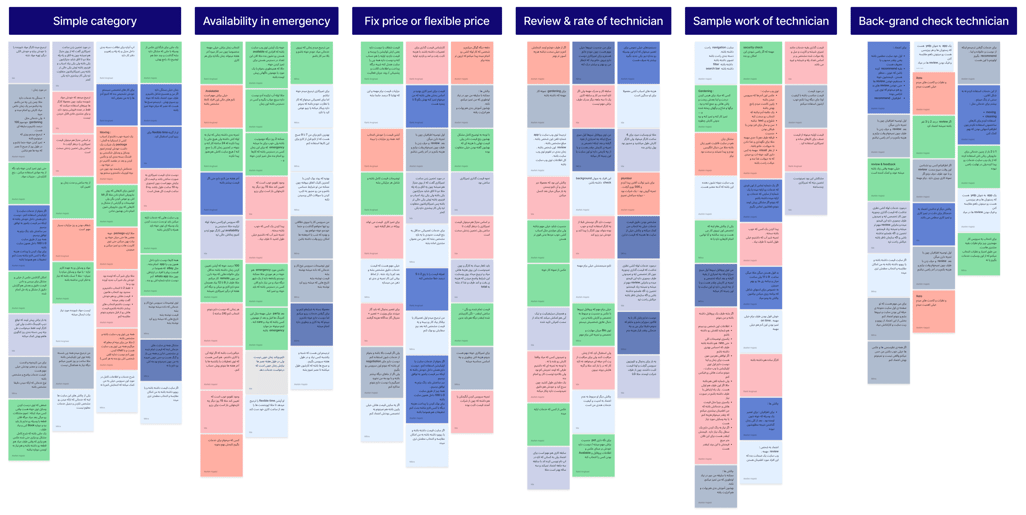
Site Map


We discovered how to organize the various sections of our website and created the initial version of our sitemap. However, through usability testing during the design process, we developed the final version of the sitemap.
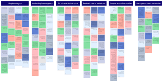
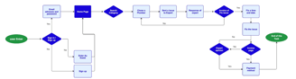
User Flow
Here, you can see the user flow from entering the website to finding a service that perfectly matches an expert.

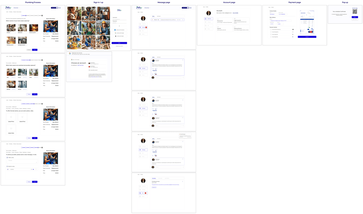
Task Flow
We designed two task flows: one for addressing a plumbing issue and another for focusing on cleaning services.

Develop
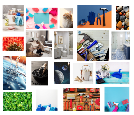
Mood board
We've chosen a color inspired by some tools and nature.

Ui kit
Using the mood board as a foundation, we developed a UI kit to ensure efficiency and consistency throughout the design process.


Sketches
Sketching consistently provides valuable insights into the design process and helps us develop user stories, site maps, and user flows


Design Solution
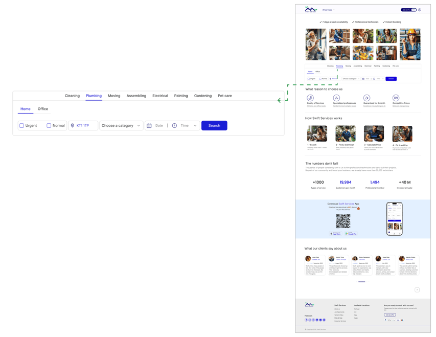
After analyzing our research data and understanding user needs, we developed solutions to address their concerns and integrated them into our design.
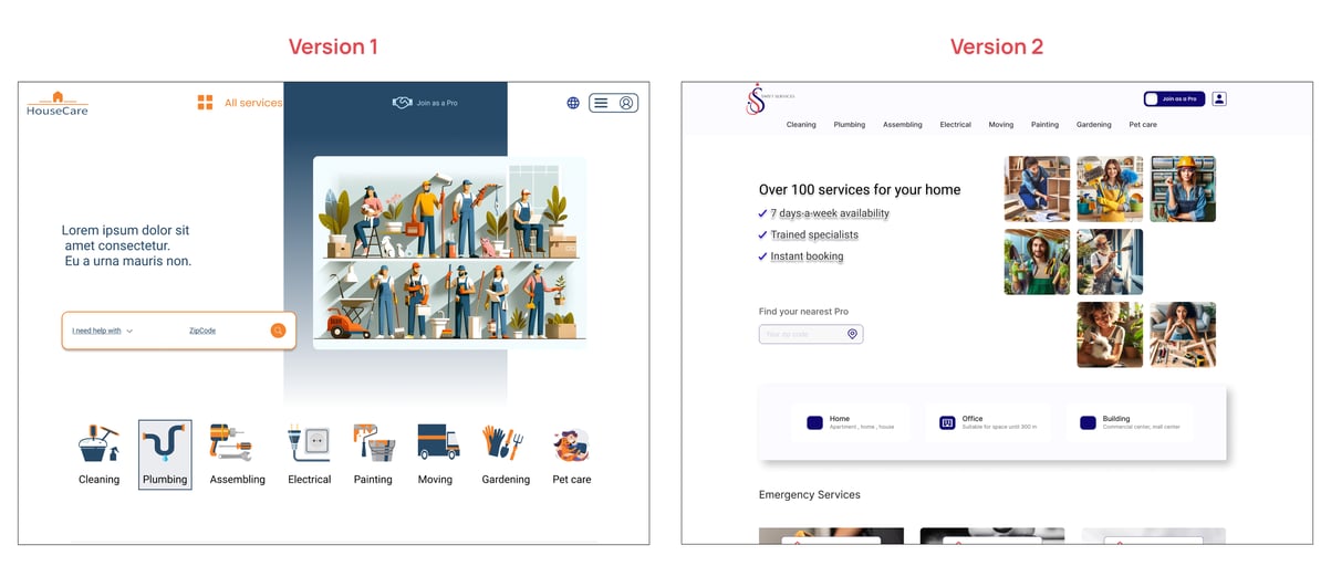
Challenge 1 : Category
Categorizing Swift Services under a broad "All Services" category is not helpful for users, as they prefer to see each service with specific and distinct search categorizations.
Solution
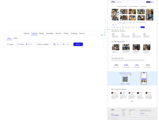
Initially, we display all available services on our website in the navbar. Then, we added "Urgent" and "Normal" options above the search bar to provide users with quick and easy access.

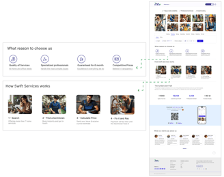
Challenge 2 : Value Proposition
Create a dedicated section on the homepage of our platform (for both user and technician modes) to showcase our value proposition and the key reasons to trust us.
Solution
There is uncertainty about the trustworthiness and recognition of this platform, which impacts its users.
Challenge 3 : How to send issue
Solution
What’s the best way to structure a form with many fields to collect detailed information for improved advice from the Technician
It became clear that each category requires a unique approach for better results, so we organized them into separate tabs for improved user experience.

Challenge 4 : Join as Pro button
Solution
We discovered that some users are interested in joining the website to leverage their maintenance skills and earn money.
The switch toggle button was designed to provide users with quick and easy access, enhancing overall usability

Mid-fidelity wireframe
We designed mid-fidelity wireframes in Figma to gather feedback and iterate on the concepts, ensuring improvements were made before progressing to more detailed phases of the design process.

Having too many options for selecting a service can confuse users.
Combining categories and search bars creates a more accessible search option for each service.
Initially, we opted to display this section with a picture, but we noticed it was confusing for users, as they didn’t realize its usefulness. So, we redesigned it using an icon and text for better clarity and engagement.
We originally designed the workflow on the website by numbering the steps, but users had difficulty understanding and connecting with the process. To address this, we decided to enhance the user experience by incorporating photos at each stage, providing visual guidance and making it easier for users to follow along and engage with the instructions.
We added numbers to show how many clients and technicians use our website to build trust and keep people engaged. This was meant to highlight the strong usage and reliability of our platform in a simple and effective way.
We created a button to help technicians connect with us more quickly and easily.
Deliver

Iterations and Usability Tests
We made multiple iterations driven by usability testing and feedback. Below are some of these iterations.
Home Page iterations

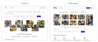


The back button located at the bottom of the page was not easily recognizable to users.
Primary Reasons for the Redesign
The absence of a ‘Select’ button on the page left users feeling confused
Technician page iterations ( quick view)
The user wants to know which area the technician will cover.
The user wants to share the technician's profile with others and gather their opinions.

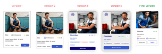
The "Book" button located at the bottom of the card was not clear to users as a way to proceed.
Primary Reasons for the Redesign
Users often want to learn more about the selected technicians, so we added a quick view feature for their convenience.
Card Technician
Technician page iterations


The users prefer to view work samples and skills or certificates in separate tabs.
Primary Reasons for the Redesign
The users were unable to find the share button, so we adjusted the layout for easier access.
The users would like to know the cancellation policy and payment terms.
Plumbing process iterations

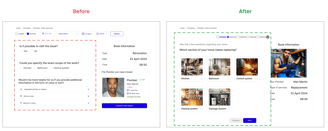
Users let us know that the way the information was presented was a bit unclear, so we made some changes to simplify things and make it easier to follow.
Primary Reasons for the Redesign
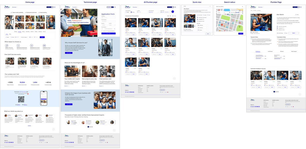
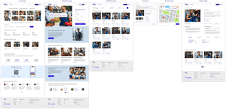
High-fidelity


Reflections
What I have learned from this project
In this project, I discovered how important research is at every stage of the design process and how it can really boost the final product.
I discovered that testing and making improvements can really help make a product more user-friendly and better received.
I learned that creating a UI kit helps maintain a consistent design and makes it easier to communicate with teammates. Plus, it simplifies any future modifications to the product.
What I can do next
Conducting usability tests and making iterative changes to improve the product’s user-friendliness.
Enhancing the accessibility of the pages to ensure they are usable for a wider range of users especially for disabled people.