Swift services
Home Service Adaptive Website and App
Project Overview
This platform links users with talented local professionals for efficient and convenient home repair and maintenance services. It serves those who either lack the time or the skills to tackle household issues, providing dependable and prompt solutions.

Our project had two main tasks:
About swift services

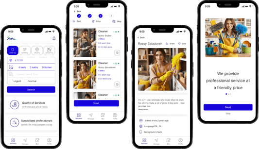
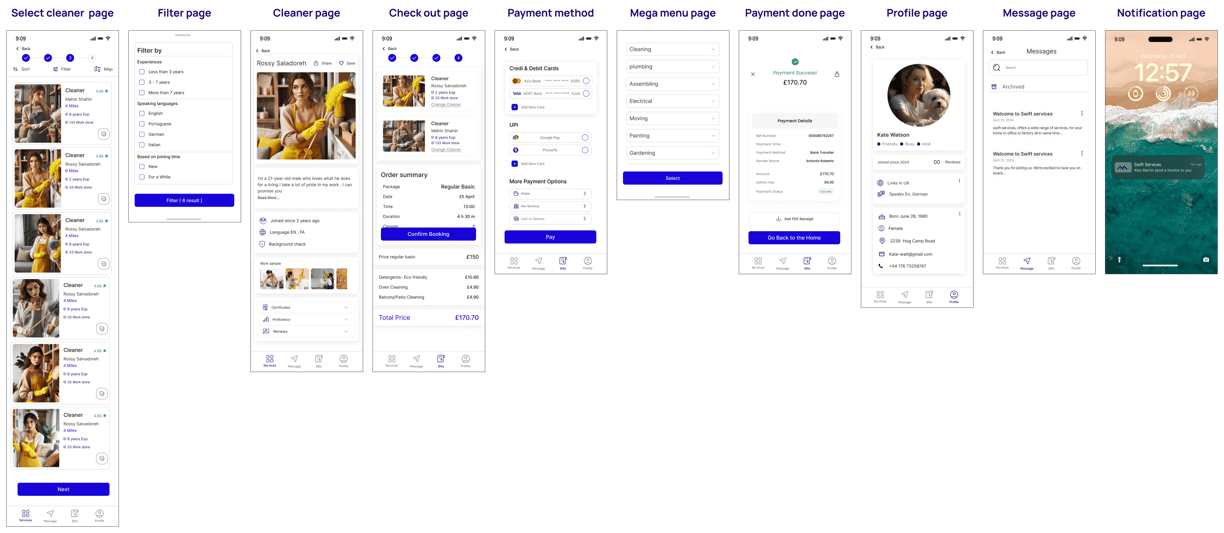
focused on finding and booking a cleaner on the App
focused on finding and booking plumbing services on website

Business Needs
There isn't a platform available that can comprehensively identify and fix all home issues, such as plumbing, cleaning, and electrical problems, etc while providing access to a diverse array of technicians to address these challenges efficiently.
Target Users
Someone who needs a technician
The technicians who provide services
Business Goals
Encourage users to choose our services.
Foster trust in our platform.
Inspire people to join us as providers.
Challenge
We offer a variety of services, providing users with a wide range of options in the search bar. It’s important to present these options in a way that ensures a great experience for each user
Design Thinking

Survey
User Interview
Competitive Analysis
Affinity Diagram
Persona
Site Map
User flow
Task flow
Mood board
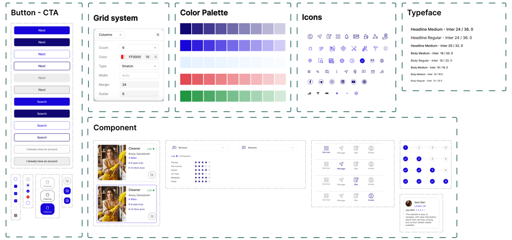
Ui kit
Sketch
Mid-fid wireframe
Prototype
Usability Testing
Accessibility Testing
A / B Testing
Solution
Initial problem
Discover
Survey
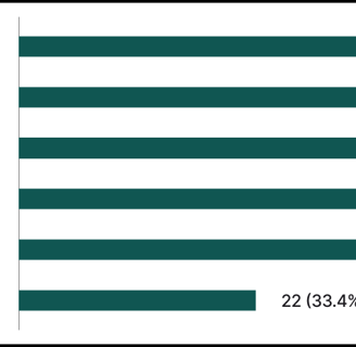
To gain a deeper understanding of user preferences, we conducted a brief survey with 64 respondents. Here are some key insights we gathered.
What concerns do you consider when booking a home cleaning service through a web application?
We have designed various sections of the app to address users' concerns and have tried to respond to them all.

Competitive Analysis
The results show that the cleaning factor is super important, and some people usually go for eco-friendly detergents more than others.
Additionally, we conducted a competitive analysis by exploring two types of websites: one with a similar business model and another to evaluate their flow and user-friendliness. This helped us gain valuable insights and inspiration.
Key Takeaways from similar business model
We needed to design a search bar navigation with many different items so we inspired several popular websites Booking.com & Kiwi.com & Airbnb.com. then we created useful search navigation.
We want to show the user's needs in the best way, so we had to check out what methods the competitors are using for that.

Key Takeaways from the Inspirational Models
User Interview

After talking to 18 potential users, we gathered direct quotes that gave us great insights and helped shape our design process.
Define
Affinity Diagram
After talking to 18 potential users and making an affinity diagram, we found a common need when people look for someone to fix a home problem.
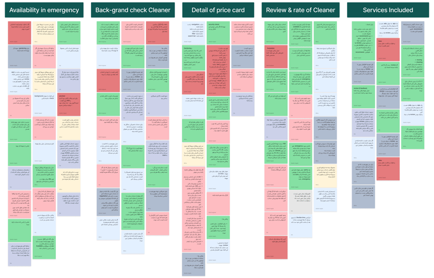
Price card: Users prioritize viewing the detailed breakdown of the price card. Having comprehensive information about each component helps them feel confident in using the services.
Key Takeaways
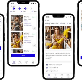
About cleaner: Users want to see a personalized profile for each cleaner, allowing them to choose based on skills, abilities, and reviews from others.
Service included: Users felt they needed more in-depth info about each service, so we provided lots of details to help them out.
Persona
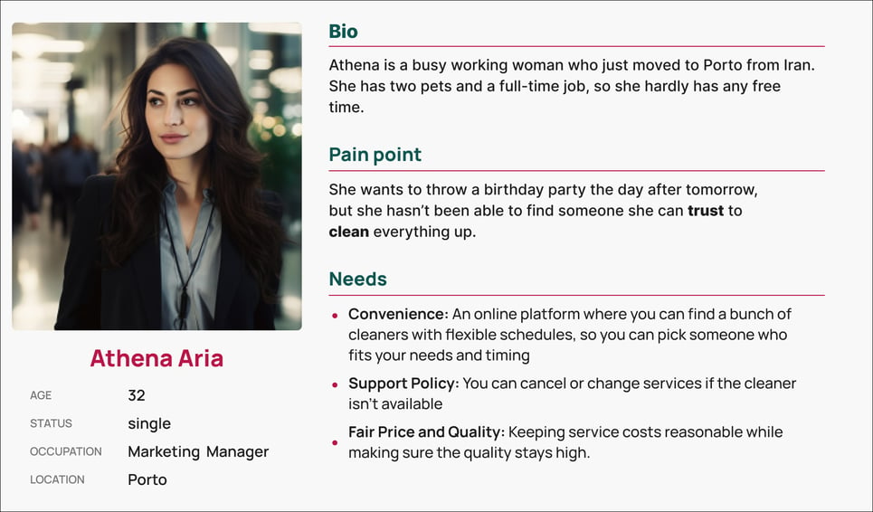
After doing interviews and analyzing the results, we created a user persona for the Swift services App. The users' needs and challenges are guiding us through the app development process.
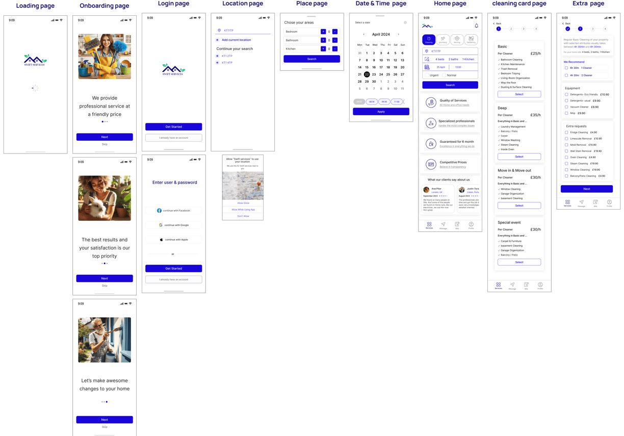
Site Map
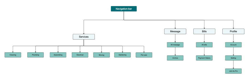

We figured out how to organize the different sections of our website and put together the first version of our sitemap. But after doing some usability testing during the design process, we ended up creating the final version.
User Flow
Here, you can see the user flow from entering the website to finding a service that perfectly matches an expert.
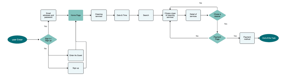

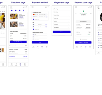
Task Flow
We designed two task flows: one for addressing a plumbing issue and another for focusing on cleaning services.


Develop
Design Solution
After analyzing our research data and understanding user needs, we developed solutions to address their concerns and integrated them into our design.
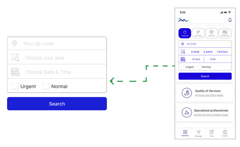
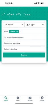
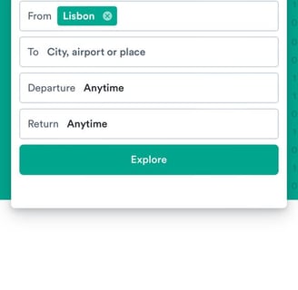
Challenge 1 : Search bar
Our goal is to create a search experience that enables users to achieve optimal results while keeping it easy to use and accessible.
Solution
We've taken inspiration from popular, user-friendly platforms and prioritized our users' needs in designing this section of the search bar.
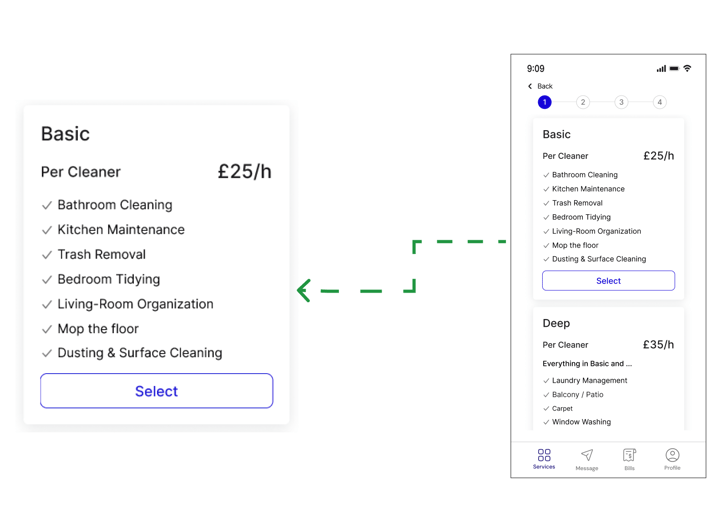
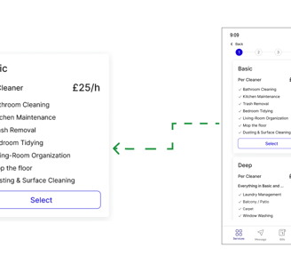
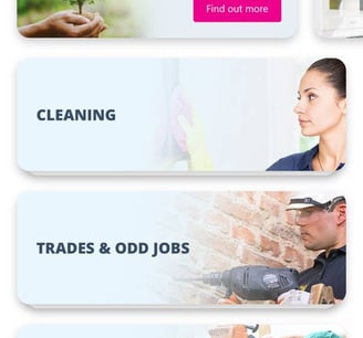
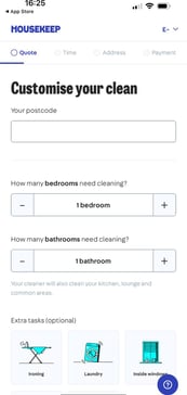
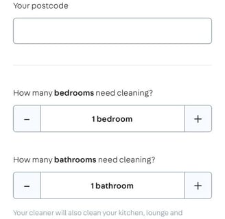
Challenge 2 : Cleaning card
Our cleaning cards feature four different types, each displaying the available options.
Solution
Through our research on information architecture and user interviews, we discovered that most people are overwhelmed by too many house-cleaning options.
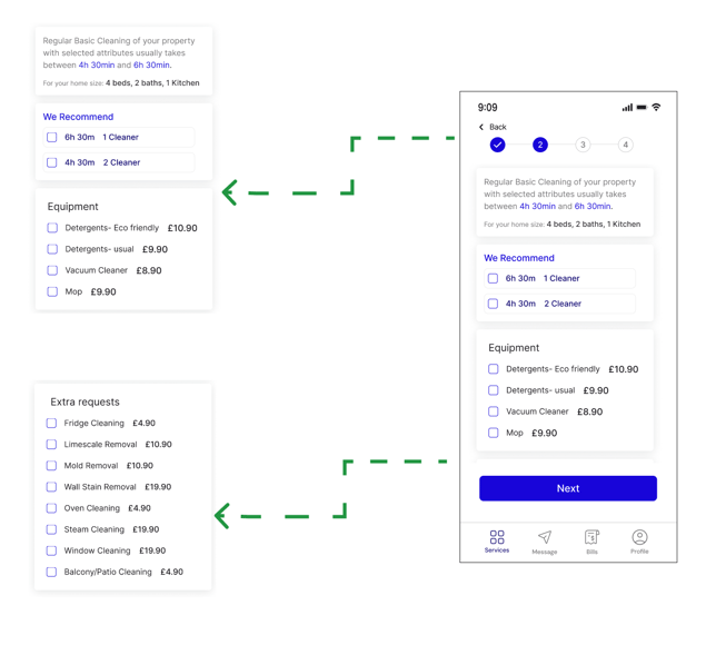
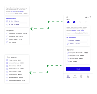
Challenge 3 : Add Extra
Solution
We have several key options that can benefit users, so it's essential to present them clearly.
We designed this section to assist users who are unsure about how many cleaners to hire or who may lack cleaning supplies.
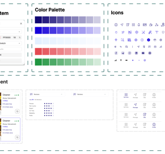
Ui kit
Using the mood board as a foundation, we developed a UI kit to ensure efficiency and consistency throughout the design process.
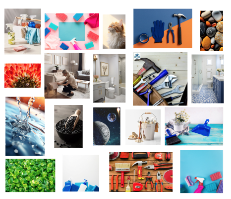
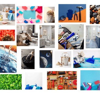
Mood board
We've chosen a color inspired by some tools and nature.
Deliver
Home Page iterations
Iterations and Usability Tests
We made multiple iterations driven by usability testing and feedback. Below are some of these iterations.


Having an icon was recognisable for users.
Primary Reasons for the Redesign
The search items are gathered into one box to make it easier for users to find them.
Search bars create a more accessible option for each service.
Cleaning page iterations


Users often missed the hamburger menu for filtering and sorting, so we redesigned it for easier access
Primary Reasons for the Redesign
Users were frequently confused about which button to click, as both buttons had the same color.
High-fidelity


Reflections
What I have learned from this project
In this project, I discovered how important research is at every stage of the design process and how it can really boost the final product.
I discovered that testing and making improvements can really help make a product more user-friendly and better received.
I learned that creating a UI kit helps maintain a consistent design and makes it easier to communicate with teammates. Plus, it simplifies any future modifications to the product.
What I can do next
Conducting usability tests and making iterative changes to improve the product’s user-friendliness.
Enhancing the accessibility of the pages to ensure they are usable for a wider range of users especially for disabled people.