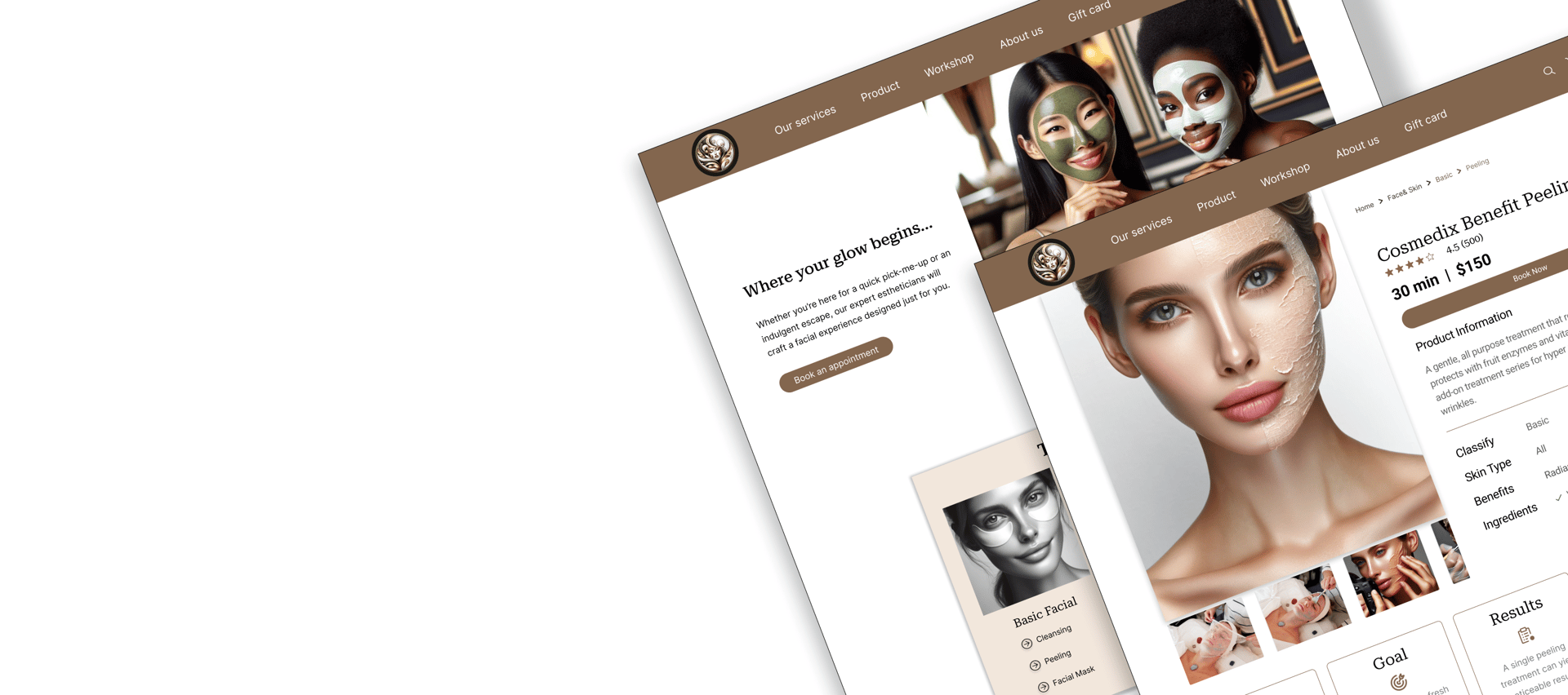
Saving Faces
Redesigned a website facial and skin treatments.
About Saving Faces

Saving Faces Skin is a skincare brand founded by two friends, focusing on organic facial treatments, massages, and waxing. Along with their customized skincare services, they sell a selection of organic products. The brand is committed to offering natural, holistic skincare solutions that address diverse skin needs and preferences with high-quality treatments
My Role
I was responsible for redesigning the client's website to improve user engagement and functionality. Upon reviewing the site, I identified problems with the booking system, navigation, and absence of customer reviews. The redesign led to a rise in online bookings and greater customer satisfaction, successfully achieving the client's objectives.
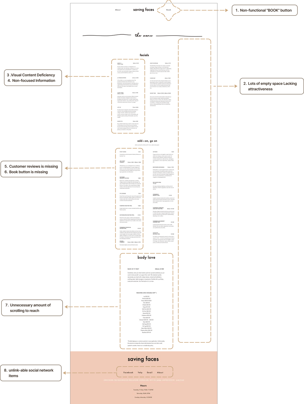
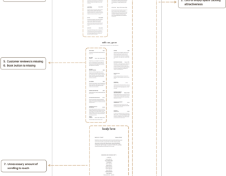
The website's 'Book Now' feature is ineffective, as users are not calling or booking services through it.
Users frequently abandon their search for services halfway, indicating difficulty finding services that match their needs based on the descriptions provided.
There is a lack of customer reviews and visual content, such as photos or videos, that effectively showcase each service.
There is excessive white space, and the content lacks consistency throughout the site.
Problem Statment
Drive More Online Bookings by introducing a streamlined and easy-to-navigate booking system.
Elevate Customer Satisfaction by enhancing the overall user experience to encourage loyalty and repeat business.
Organize Service Categories to make it easier for users to browse and choose from the available services.
Increase Product Sales by simplifying the process of finding and purchasing organic skincare products.
Optimize the 'Book' Button by ensuring it is fully functional and prominently positioned on the homepage.
Showcase Customer Feedback by adding customer reviews to boost credibility and offer social proof.
Business Needs


Design Thinking
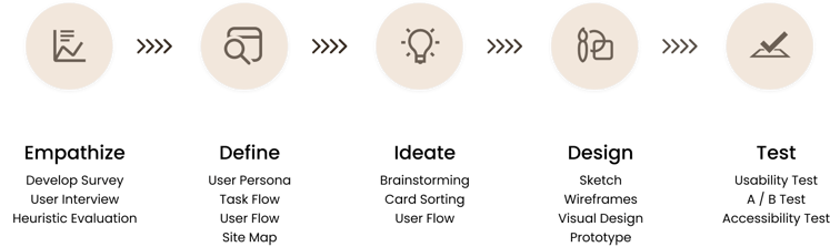
Our team of three utilized the Double Diamond Design framework, drawing from Design Thinking principles. Instead of following a linear path, we adopted an iterative approach, continually revisiting and improving each stage during the project.
Discover
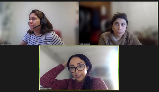
In our meeting, we adopted a comprehensive research approach to identify users' pain points and create effective solutions
My teammates and I thoroughly evaluated the website to assess its usability, focusing on navigation, information clarity, consistency, and error prevention. Based on our analysis, we enhanced the browsing experience and made it more user-friendly.
The "Book" button is non-functional, as it doesn't trigger any action or redirect to a page.
Service details are unorganized, with no clickable links directing users to individual services.
There is a lack of visual content, such as images or videos, to highlight the services offered.
The reservation page is broken, preventing users from making bookings.
No map or address is provided, making it challenging for users to find the business location.
Heuristic Evaluation
Key Takeaways

By analyzing our competitors, we gained valuable insights into the features, functions, and user flows that should be on the homepage. This allowed us to identify opportunities to create a product that stands out from the competition.
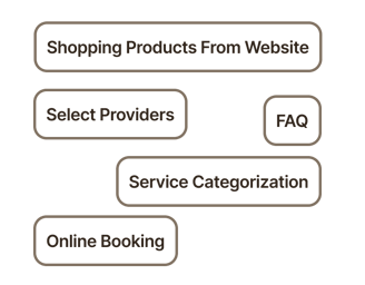
Online Booking: The online booking process must be simple and user-friendly to encourage users to utilize it.
Shopping products from the website: There was no basket or product page for purchases, so we integrated it into the homepage and service process. This allows users to buy products easily during their booking journey.
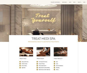
Service Categorization: We discovered that the primary reason users were leaving the website was the lack of an organized menu.
Select Providers: We found that some users wanted to select their service provider, but this wasn't possible due to the absence of a proper user flow.
FAQ: The website offered a wide range of services, and users were often confused about which one suited them best. They wanted to read reviews from others who had used the services to help guide their decision.
Competitive Analysis
Key Takeaways


In order to gain a better understanding of user preferences, we conducted a brief survey and gathered valuable insights. Here are the key findings.
Importance of Reviews: Participants stressed that reviews play a crucial role in their decision-making when choosing skincare services, facials, or specific operators.
Flexible Booking Preferences: Users prefer to book skincare services as needed, emphasizing the importance of having a user-friendly, on-demand booking system.
Operator Selection: Users highly value the ability to select their preferred operator, making this an essential feature to include.


Develop Survey
Key Takeaways

Below are some quotes from users that helped us gain a deeper understanding of their needs.
User Interview

We have done an open card sorting exercise with several potential users to develop a more user-friendly information architecture. However, we could not obtain much information, so we decided to repeat the process with close card sorting. Below is an example of one user’s card sorting results.
Card Sorting
Define
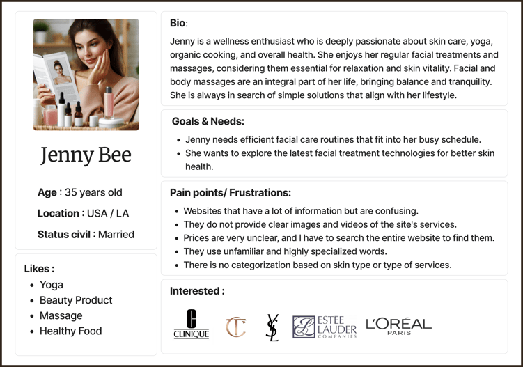
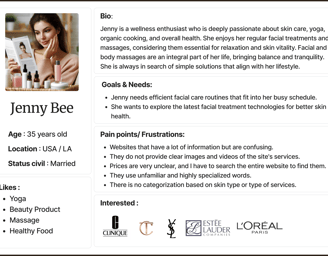
The persona was created based on insights gathered from user research.
Persona


To align our information architecture with user expectations, we conducted six open card sorting sessions through the Optimal Workshop platform. Following the initial exercise, we created the first version and refined it iteratively based on user testing and competitive analysis.
Site Map


User Flow
Task Flow
Develop
Iteration & Wire-Framing
The most important takeaways from our research are challenges and solutions.
Challenge 1 : Correct & Classification
We started by organizing the website's services into groups based on their descriptions. But when we showed these groups to the people involved, they gave us some constructive feedback! They pointed out some areas where we could be more accurate and even suggested some new groups that made a lot of sense.

We then had two friendly meetings with them to discuss and improve the groups. We worked together until everyone felt good about the final organization. This new setup makes it easier for people to find what they need on the website, which is great for both the users and the business!
Upon closer review, we realized that the menu on the homepage was not entirely clear to users.
Solution :
Challenge 2 : Feedback Balance
To make this happen, we suggest showing related products on the user’s cart page. This way, customers can easily find products that go with their services, making their experience smoother and helping the business grow its sales.
The stakeholder wants to make the user experience better while also increasing sales. At the same time, users have mentioned they’d like to see related products when booking services.
Solution :
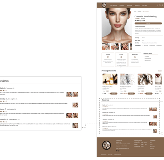
Challenge 3 : The book button was not functional
The original website's book button was not functional, making it difficult for users to schedule appointments.
Solution :
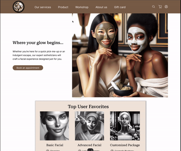
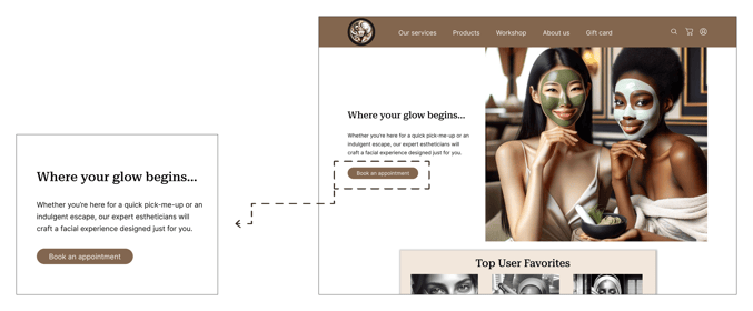
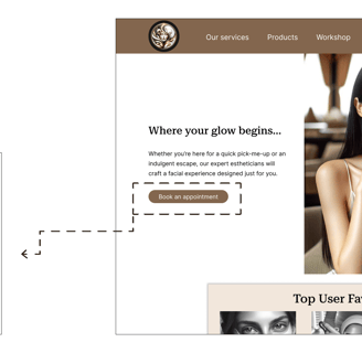
To ensure easy access for everyone using our website, we added a functional button on the homepage. Additionally, we included this button on every service card and page, making it even more accessible for our users.


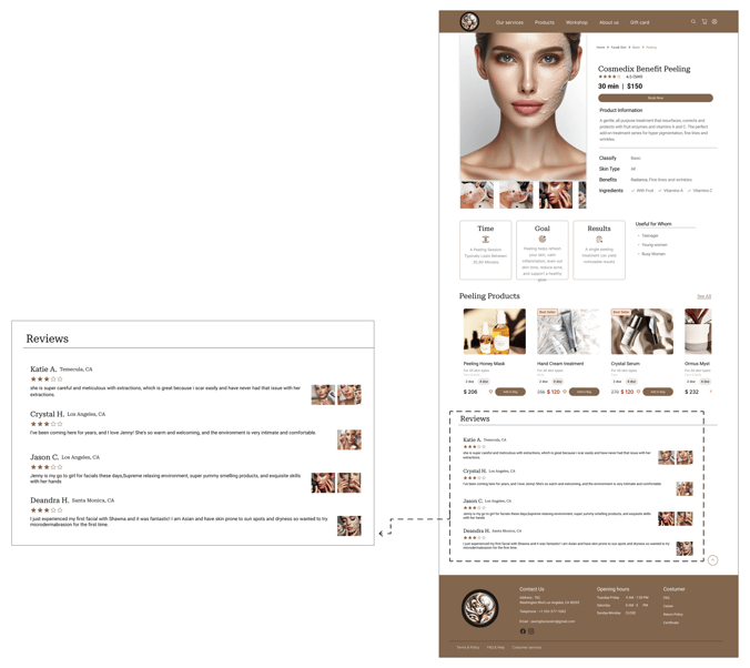
Challenge 4: Add a review and results for each services
Currently, not all services have a review and results step available.
Solution :
We’ve added a review and results step for each service to improve transparency and boost user satisfaction. This feature enables users to read feedback and see the outcomes or benefits of a service, helping future customers make better-informed choices and supporting ongoing improvement.
Deliver
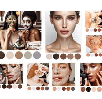
Color Exploration and Inspiration
To create a stronger connection with our users, we propose using colors that are more relevant to different skin types, making the website feel more relatable and visually appealing.

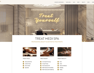
Mid fidelity Wireframe
To create a stronger connection with our users, we propose using colors that are more relevant to different skin types, making the website feel more relatable and visually appealing.